Part 3 of 8 · Brand
Brand your reading list.
Decide how your app looks and how it speaks, write it down once, and have your agent turn it into a page you can open.
By Ahmed Gadir9 min read
You have a plan that says what each screen contains. This part decides what those screens look like and what the app says to the person using it, before a single one of them is built. It follows docs/epics/03-brand.md in your project, the third of the six epics, in four stages lettered A to D.
By the end you will have three things you did not have before: a document that records every decision about the look, a set of named values the agent builds from, and a page inside your own app showing all of it at once. The last stage is the first real job you give an agent in this series, so it is also where you find out what asking for one bounded piece of work feels like.
Why decide the look first
There is a way of theming an app with an agent that almost everyone tries first. You look at the screen, decide it is a bit flat, and ask for something nicer. You get something nicer, and the next day something nicer again. After a fortnight the app has been restyled twenty times and still has no look of its own, because no decision was ever written down. Each request started from whatever the last one happened to produce.
The cause is that the agent has nowhere to look up the answer. Asked to add a button, it has to invent a colour, a corner radius and a size, and it invents slightly different ones each time. Your taste is in your head and in a conversation that will be gone next week.
The fix is unglamorous and it works: decide once, write it down in the project, and have everything built from what you wrote. That is what this part produces, and it is why it comes before the build rather than after it. Nothing gets restyled later because nothing was styled by guesswork in the first place.
A brand pack and design tokens
Two terms are worth having straight before you ask for either of them.
A brand pack is one document in your project that holds every decision about how the app looks and how it speaks: its name, the colours and what each one is for, the typefaces and sizes, the spacing, the corners, the shadows, the tone of voice, the real sentences the app will show and a description of the mascot. It lives at docs/brand/brand-pack.md. It is written for you, so it explains as well as states, and you should be able to read it and disagree with it.
A design token is a named value that the app is actually built from: --accent rather than #6D28D9, --space-4 rather than 16px. The name says what the value is for, which is what makes it useful to an agent — “use the accent colour” is an instruction it can follow correctly, while “use purple” is not. Tokens live in src/tokens.css, and because every screen refers to them by name, changing a value in that one file changes every screen that uses it.
The two files hold the same decisions. The brand pack explains them in sentences; the tokens state them in the form the code can read. If a value changes later, it changes in both.
1. Start from something you like
Stage A produces no files. It produces an agreed description of the look, and it starts somewhere easier than a blank page: an interface you already like.
Find one. It can be a page template, or a product or company whose interface you admire and use happily. This is quicker and gives a better result than asking an agent to invent a look for you, because people recognise what they like long before they can describe it. You are allowed to combine more than one — the layout from one, the typefaces and spacing from another — as long as you know which part is coming from where.
Then say what you like about it, in your own words. “It feels calm” is a real answer, and turning it into specifics is the agent’s job in this stage: is it the roominess, the big confident headings, the near-absence of colour, the soft corners, the plainness of the buttons? What comes back should be a list of visible choices you can recognise, so that you know what you are asking for.
One line matters here, and your agent has been told not to cross it. You are borrowing an approach: how much space is used, how large the headings are, how restrained the colour is, how plain the controls are. You are not taking anyone’s logo, artwork, illustrations, photography, name or exact look. Those belong to whoever made them. Your colours are your own, and choosing them is the other half of this stage: say what you want, or ask for a few suggestions and pick.
Stage A: say what you like
Work on epic 03, stage A only, then stop.

I want to decide how this app looks before we build it, and I want to start from something I already like rather than from nothing.

Here is my reference: [a link to a template or a product, or a description of one]. What I like about it is [what you like: the roominess, the big headings, how little colour it uses, the soft corners, the plain buttons]. [If you are combining two: I want the layout from the first one and the typefaces and spacing from the second.]

Tell me which visible choices are actually producing that, so I know what I am asking for. Then ask me anything you need to know about the colours.

I want to borrow the approach, not the identity. Do not copy anyone's logo, artwork, name or exact look. The colours will be mine: [the colours you want, or "suggest a few and I will pick"].

Don't write any files yet. Just agree the description with me.
Paste this into your project conversation.
Read what comes back and push on anything vague. If it says “clean and modern”, ask which choices make it so. You should finish this stage able to describe your app’s look to another person in four or five sentences.
2. Write the decision down
Stage B turns that description into the two files. It is the stage that makes the difference between having taste and having a decision.
Three parts of it are worth understanding before you ask, because you will be judging the result.
The colours need jobs, not just names. A palette listed as five swatches tells the agent nothing about where to put them. A palette written as roles — the page behind everything, the surface a card sits on, the ordinary divider, body text, quiet supporting text, the one accent that marks the action worth taking — can be applied correctly without guessing. Our reference app ended up with twenty-one roles, which sounds a lot until you notice that most of them are paper, ink and a line.
Contrast has to be measured. Contrast ratio is a number describing how different two colours are in brightness, from 1:1 for identical colours up to 21:1 for black on white. Ordinary text needs to reach 4.5:1 against whatever sits behind it, and large headings 3:1, if people are to read them comfortably — including people reading on a phone in daylight. An agent asked whether a colour is readable will cheerfully say yes. An agent asked to calculate the ratio and show you the number cannot, and the prompt below asks for the number. If a colour you wanted fails, you want to be told the figure and offered the nearest one that passes, not quietly given a different colour.
The wording is part of the look. What the app says when the shelf is empty, when nothing matches a search, when you leave the title blank and when saving fails does more to give it a character than any colour will. Deciding it now, in one place, also stops it being improvised differently on every screen. Our reference app’s empty shelf says “Every library starts with one book”, and it says “This browser couldn’t save your changes” rather than “Your changes were not saved”, because the first owns the problem and the second hands it to the reader.
Stage B: write it down
Work on epic 03, stage B only, then stop.

Write what we agreed into docs/brand/brand-pack.md, so we never have to have this conversation again. Put in it: the app name; the colours with their values and what each one is for, with the contrast numbers; the fonts and every size we will use; the spacing scale; the corner radii; the shadows; how the app speaks, with examples of what to do and what not to do; and the real wording the app will use, which is the empty state, the "nothing matched" message, the message when I leave the title blank, the message when saving fails, the remove and undo wording, and every button label. Then a description of the mascot.

Put the same values in src/tokens.css as CSS custom properties, and import that file first in src/styles.css. From now on, every colour, size, space, corner and shadow in this app comes from those tokens, and every message comes from the brand pack.

Work the contrast out properly and put the real numbers in. If a colour I asked for fails, tell me the number and suggest the nearest one that passes. Don't quietly use something else, and don't tell me it's fine without measuring it.

Then stop and let me read the brand pack.
Paste this into your project conversation.
Read docs/brand/brand-pack.md when it appears, and read the wording aloud. This is the one part of the pack where you are the only expert: nobody else knows whether those sentences sound like you. Change anything that does not.
3. Have your agent draw the mascot
Stage C is the one people assume needs an image tool. It does not, and the reason is worth knowing.
SVG is a drawing described in text. Instead of a grid of coloured dots, the file says where the lines, curves and shapes are, how thick their outlines are and what colour each is filled with, and the browser draws it when the page opens. That is why a coding agent can draw one: writing an SVG is writing text, which is the thing it is best at. It is also why the result stays sharp at any size, weighs almost nothing, and can take its colours from your tokens like everything else on the screen. Change the accent colour later and the mascot changes with it.
The other benefit is that you can adjust it by asking. Rounder, friendlier, less tall, happier, smaller eyes. The drawing is code, so a change costs nothing and you can do it as many times as you like. Ask for two or three moods it can use later — waving, reading, celebrating — and for a short description of what it is doing, so that someone using a screen reader is told there is a character there rather than being met with silence.
An image tool is the other way to get a mascot, and you may prefer one, but a generated picture sits outside the tokens and cannot follow a change of palette.
Stage C: the mascot
Work on epic 03, stage C only, then stop.

Draw the mascot from the brand pack yourself, as an SVG component in src/Mascot.jsx. Take every colour in it from src/tokens.css, so it follows the palette if we change it. Give it two or three moods the app can use later, and an aria-label that says what it is doing.

Keep it simple enough to read at a small size. Don't wire it into the app yet. Show it to me and I'll tell you what to change.
Paste this into your project conversation.
Then look at it, and say what to change. As many times as it takes:
Adjust the mascot
Make it [rounder / friendlier / less tall / happier / smaller-eyed].
Paste this into your project conversation.
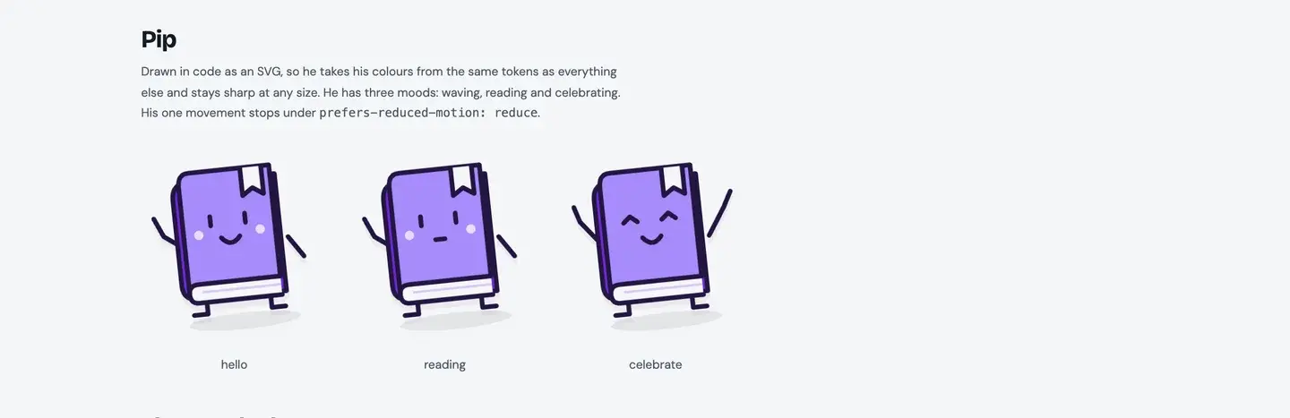
Keep it simple. A character built from a few shapes reads better at the size it will actually appear than a detailed one does, and it survives being shrunk into a corner of a phone screen. Nothing gets wired into the app in this stage; the mascot is placed during the build, along with everything else.
4. Build the style-guide page
Stage D is where the decisions finally become something you can look at. Your agent builds a style-guide page: a second page inside your project, at style-guide.html, showing the colours with their values and jobs, the type sizes, the spacing steps, the corners, the shadows, the buttons, a form field, a book card, the empty state, a validation message, the mascot and the wording samples, all on one screen.
It is kept separate from the app on purpose. Nothing in the reading list links to it, so it cannot complicate the app or break its tests, and you reach it by its own address.
One instruction in the prompt does the real work: the page must read the values out of src/tokens.css as it loads, rather than having them typed into it. A page with the colours typed in is a picture of your tokens as they were on the day it was written, and it starts lying the first time one changes. A page that reads them cannot drift. If your agent finds itself typing a colour into that page, the value belongs in the tokens instead.
Stage D: the style-guide page
Work on epic 03, stage D only, then stop.

Build me a small style-guide page inside the project, at style-guide.html, showing everything from the brand pack in one place: the colours with their values and what each is for, the type sizes, the spacing steps, the corners, the shadows, the buttons, a form field, one book card, the empty state, a validation message, the mascot and the wording samples.

Read the values out of src/tokens.css when the page loads instead of typing them into the page, so the guide can't drift from the app. If you find yourself typing a colour or a pixel value into that page, it belongs in the tokens instead.

Keep it separate from the app so it cannot break the reading list. Nothing in the app should link to it. Give me the address to open it, and check it on a phone width too.
Paste this into your project conversation.
Open the address it gives you. This is the first thing in this series that an agent has built for you, and it is worth spending a minute on rather than glancing at.
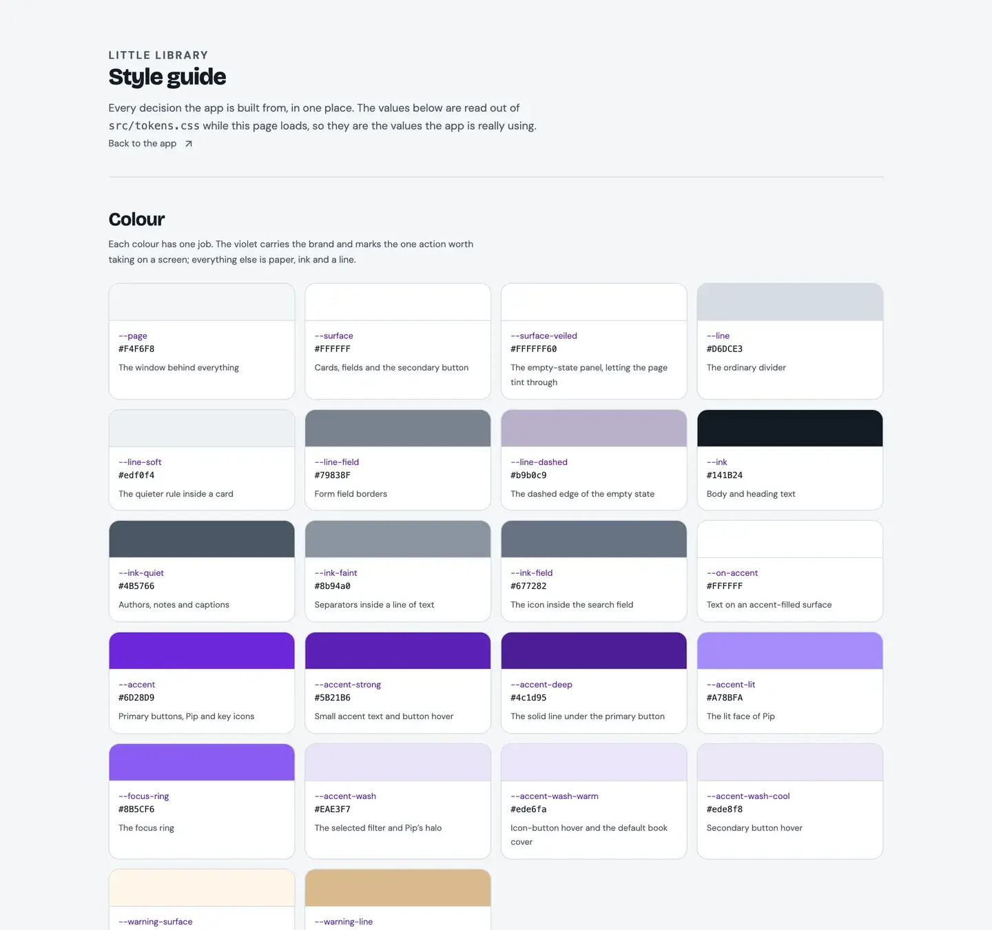
Check it at a phone width as well, by narrowing your browser window. Then read the colour list and ask yourself whether every colour still has a job you can name. A colour with no job is one the agent will misuse later, and deleting it now is free.
Expect to keep adjusting
None of this means the look is now frozen. A palette that looked right as a row of swatches can turn out to be too heavy once there are twenty book cards on a page, and you will only discover that in the next part, when there are twenty book cards on a page.
That is not a failure of the method. The difference is where the adjustment goes. Without a brand pack, you would patch the colour into whichever screen you happened to be looking at, and the app would drift a little further out of agreement with itself. With one, you change the value in the tokens and the brand pack, once, and every screen follows — including the style-guide page, which is reading the same values.
FAQ
Can I just copy a design I like?
No, and your agent has been told to refuse. Another company’s logo, artwork, illustrations, photography, name and exact look belong to them, and an app that reproduces them is a problem whatever the intention. What you can take is the approach: how much space is used, how large the headings are, how restrained the colour is, how plain the controls are. That is the part that makes an interface feel calm or confident, and it is not anyone’s property.
What if I have no idea what I like?
Look at the three or four apps and sites you use most happily and ask what they have in common. Most people find the answer surprisingly consistent. If nothing comes to mind, ask your agent for a few starting points to react to and pick the one that annoys you least: recognising what is wrong with an option is easier than inventing one, and it gets you to the same place.
My colour failed the contrast check. Do I have to change it?
You have to change it where it carries text. A colour too faint to read is not a style choice; it is text that some people simply cannot read, and daylight on a phone screen makes that far more common than it sounds. You can usually keep the colour you wanted for larger areas and use a darker version of it for the text, which is what the agent should offer you when it reports the number.
Do I need a mascot at all?
No. It is in the brief because a character gives the empty screen someone to be friendly at, and because drawing one shows what an agent can do beyond arranging boxes. An app without one is a perfectly good app. If you skip it, say so in the brand pack so the later parts do not go looking for it.
Should I look at the finished example’s brand pack?
It is in the complete project ZIP, at docs/brand/brand-pack.md, and it is useful as a shape to copy rather than a set of values. Ours records three colour pairs that fall short of the contrast threshold instead of hiding them, which is the habit worth taking from it.
Further reading
- Design Systems 101Nielsen Norman Group
What a design system and a style guide are, and why larger teams write their decisions down. No code, and it explains the reasoning behind what you have just done by hand.
- Contrast and Color AccessibilityWebAIM
A careful explanation of contrast ratios, the 4.5:1 and 3:1 thresholds and what the exceptions are. A few short colour values appear, always with an explanation beside them.