- Design
- Game design
Your app’s interface is 10,000 years old
By Ahmed Gadir
Published
Summary
Screens are new, but the places we use them in are not. We have always sung round a fire, worked at a bench, read in a quiet corner and killed time on the move, and each of those rooms wants a different interface: big and loud, dense and deep, calm and simple, or tiny and one-handed. Before you design a single screen, decide which room your app will actually be used in. The idea comes from Jesse Schell’s The Art of Game Design.
Your app will be used in a room. Which room decides more about its interface than any trend, framework or design tool, and the rooms have barely changed in ten thousand years.
The game designer Jesse Schell makes this point about games in The Art of Game Design. Humans have always played in the same few places, and each place shapes what gets played there. Technology changes every year; the places do not. [1] The same is true of apps. Here are the four private rooms, what they were, what they are now, and the interface each one wants.
The hearth


The hearth is where the household gathers. It used to be the fire; now it is the television, and the interface for it is big, loud and colourful, built to be watched by the people who are not holding the controller as much as by the one who is. There are two players, maybe four, and no menus to speak of. SingStar, Just Dance and the Wii all understood the room: the game is the performance, and the screen is a stage.
The workbench


The workbench is where difficult things get done, for hours at a time, by someone who has chosen to get good at them. Its interface is dense and demanding, with every number on screen and a tool for everything within reach. World of Warcraft’s default interface shows action bars, chat, bags and a map at once. League of Legends asks you to learn a hundred things. Excel is the same room with a different purpose, and nobody complains that it has too many menus, because at the workbench depth is the point.
The reading nook
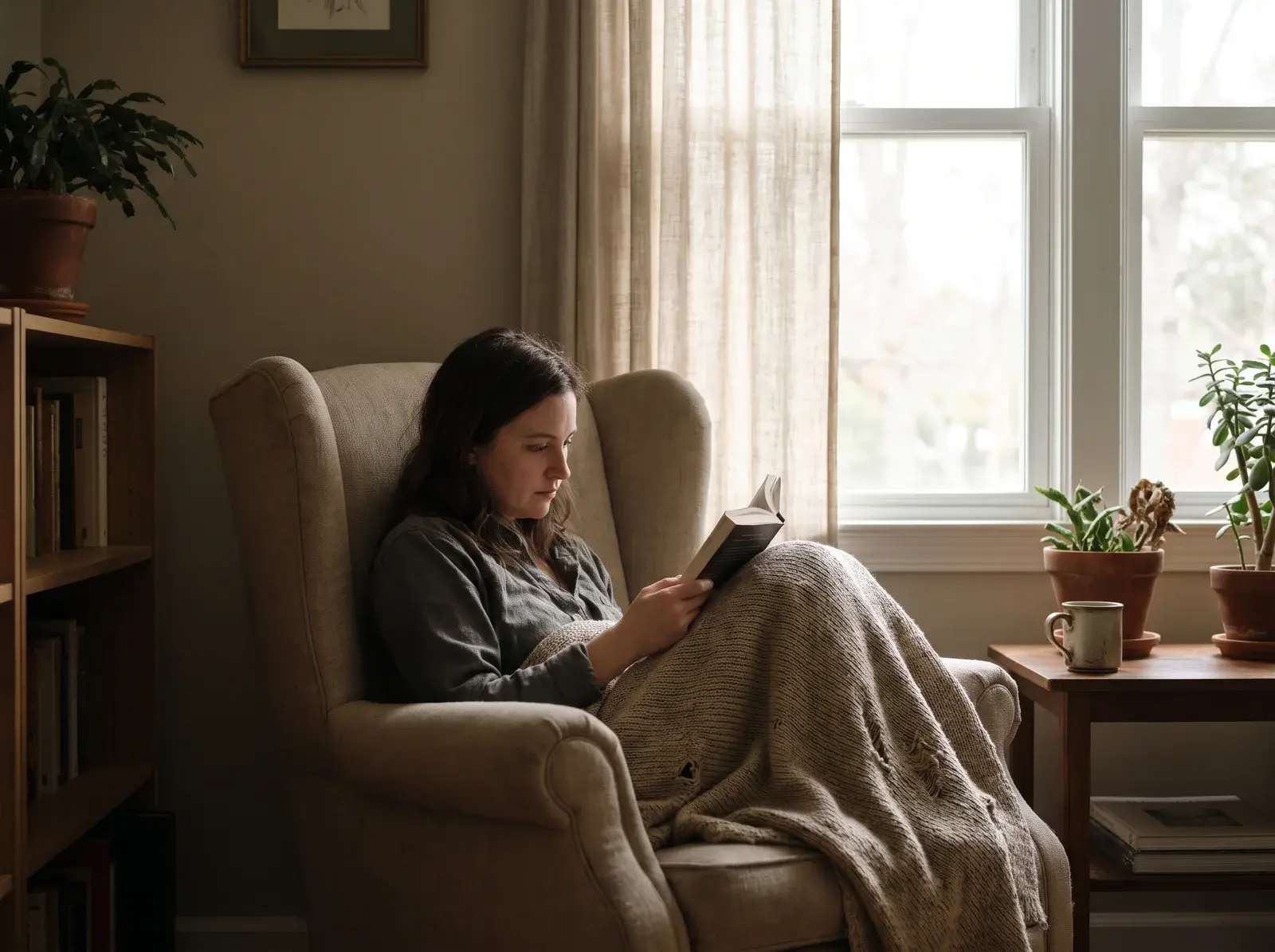

The reading nook is private, quiet and unhurried. You lean back, you do one thing, and nothing is timing you. The interface is simple and calm, with one thing on screen at a time and no clock. Monument Valley is a nook game: one puzzle, no score to chase, no penalty for stopping. The Kindle is a nook device, and the apps people reach for in bed, the slow puzzles and the long reads, belong to the same room.
Anywhere


Anywhere is the bus, the queue and the two minutes before a meeting. The crossword lived here before the phone did. The interface is tiny, interruptible and usable with one hand, and it asks for nothing up front: no sign-up before the first go, no payment before the first value. Wordle fits in a thumb and ninety seconds. Duolingo is a lesson you can finish between two stops. Anything that needs both hands, a long session or a quiet mind does not belong in this room.
The room decides the interface
Put the four side by side and the pattern is hard to miss. The hearth wants big and loud. The workbench wants dense and deep. The nook wants calm and single-minded. Anywhere wants tiny and one-handed. None of these is better than another, and an interface that is right for one room is wrong for the other three. A dense dashboard on a phone in a gym queue is a workbench interface in the wrong room. A one-button app on a desktop monitor is an anywhere interface in the wrong room.
Most apps are designed for no room at all. They are designed for the screen size in the design tool, and the room is discovered later, by the users, in the reviews.
The public rooms
Schell’s list has public venues too, and apps live in those as well. The arena is competition witnessed in public, with the result a matter of record, and its interface is the scoreboard: Strava’s segments and leaderboards, a chess rating, a quiz in a pub. The theatre is a crowd watching one thing together, which is what a live stream with its chat is, and what a watch party is. The museum is browsing exotic things slowly and imagining owning them, which describes Pinterest, Airbnb and the App Store’s Today tab: big imagery, a slow scroll, discovery over efficiency. Two sit between public and private: the gaming table, several people round one surface, as with Jackbox using phones as controllers or a shared whiteboard; and the playground, improvised and outdoors, where Pokémon Go lives.
A gym, for what it is worth, is half arena. People lift in public, and some of them want the record kept.
The question to ask before you design a screen
“Games and technologies change constantly. Venues change very little.” [1] So before you draw a wireframe or pick a design system, ask where the app will actually be used. Standing or sitting? One hand or two? Two minutes or two hours? Alone or with people watching? The answers tell you how much can be on the screen, how big the targets need to be, whether a session can be interrupted, and whether anyone will tolerate a sign-up before they get something.
Stop designing for the screen. Design for the room.
Sources
Jesse Schell — The Art of Game Design: A Book of Lenses. The chapter on venues, chapter 3 in the current editions, and its lens, the lens of the venue, where the private venues (the hearth, the workbench, the reading nook and anywhere) and the public ones (the theatre, the arena, the museum, the gaming table and the playground) are set out. It is written for game designers, and the venues apply to any product people use in a place.