- Design
- User experience
Great user interfaces are like well-designed doors
By Ahmed Gadir
Published
Summary
The best user interface is the one nobody notices. A door with a handle on both sides and a sign saying push or pull works, but people still get it wrong, because it asks them to read. A door with a plate on one side and a handle on the other is used correctly without a thought. Making something that simple takes more care than adding a sign, and it is always worth it.
The best user interfaces are the ones you don’t notice. A door shows why.
Two doors
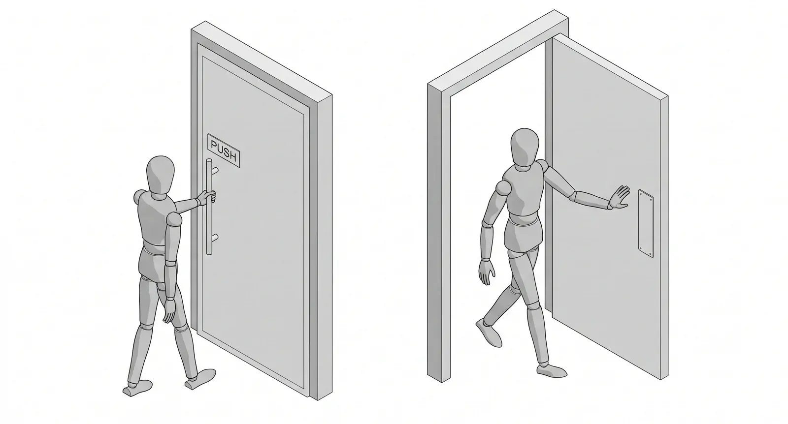
The first door has a handle on each side, and a sign on each side saying push or pull. It works. People still get it wrong, because the handle says pull and the sign says push, and whichever one they trust, half the time it is the wrong one. The sign is there because the door needed explaining, and a door that needs explaining was built without much care.
The second door has a flat plate on one side and a handle on the other. Nobody reads anything. You push the plate because there is nothing to pull, and you pull the handle because there is nothing to push. People walk through it as if it were not there.
Simple takes more effort
Making the second door is harder than making the first. Adding a sign takes a minute. Taking the sign away means understanding how people behave at a door, and then building it so that the right action is the only one available to them. It is more work every time, and it is always better, because the person using it never has to think about the door at all.
The signs on your app
Every label that explains a control, every tooltip, every screen that walks a new user through the interface is a sign on the door. Each one is an admission that the control did not explain itself. Ask what the plate would be: the version where the right action is the obvious one and nothing needs reading. If you cannot find it yet, you have found the work.
When a user interface is doing its job, it is invisible.